Overall Comments: The sketches are amazing. I am extremely impressed by the quality of your work. You followed the directions extremely well and I tremendously appreciate that.
The critiques below are fairly minor modifications I think and should be easy for you to incorporate.
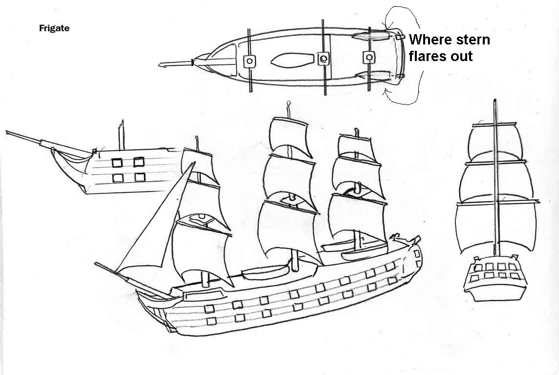
Frigate
1. The stern (as seen from overhead) flares out a bit. This should just be rounded off naturally (with NO flare).
In fact, I've drawn up a sample stern view for what I would like the stern to
look like:
2. No lifeboats aboard
3. The bow in the full scale sketch picture looks great. The bow in the closeup should be more rounded (with a downward curve) near the bottom of the bow.
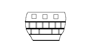
4. The poop deck on the stern is raised up more than I want. Have the poop deck be raised up less, and have the raised portion be shorter in length. Instead of the poop deck beginning immediately after the main mast, have the poop deck begin midway between the main mast and the mizzen mast (furthest back).
5. There are two protruding bumps on the stern, that jut upward and backward, and represent small boom cranes that could be used to raise and lower stuff. Please remove them.
6. Make gun ports a little smaller and a little tighter together so that there can be more of them on both rows.
Make sure they stay square though.
7. Move main mast slightly closer to the front mast. It's okay to have the distance between the main main and front mast be greater than the distance between the main and mizzen mast, but I don't want quite as much of a difference as is being shown right now.
8. In order to add strength to the resulting plastic piece, I think the
bottom edges of the bottom sails should touch the deck of the frigate.
That way the masts won't snap off as easily when the pieces are all jumbled up
in a bag and shipping across the country.
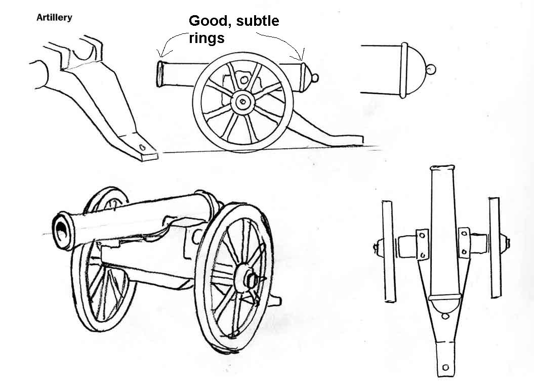
Artillery - Virtually perfect as is shown in the upper right hand picture (the
one that has my notes).
1. Keep the ring around the cannon barrel at the breech (back of the barrel) subtle. I want it to be visible, but not very pronounced.
2. Keep the flare/ring at the cannon barrel's mouth subtle. Again, I want it to be visible, but not very pronounced.
Note: The upper right profile of the artillery cannon (see collage of artillery pics cited above) is the one that I like best (as far as showing just a slight ring at the breech and mouth of the cannon barrel). You can see I've noted "Good, subtle rings" on the one I like the best.
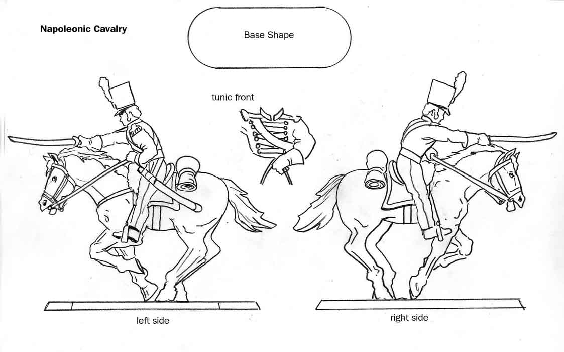
Cavalry
1. Legs are too straight, should have a crook at the knees and as the soldier leans forward, he should almost be pushing back against the stirrups with his bent legs.
2. Instead of being angled forward (with straight legs), the stirrups should be angled backward at the same angle (with bent, crooked legs).
3. Horse's mouth should be clamped tight against the bit in its mouth.
4. Blanket roll should be a little closer to the soldier's butt. The back of the saddle probably shouldn't be seen in order to allow the blanket roll to move closer to the soldier's butt.
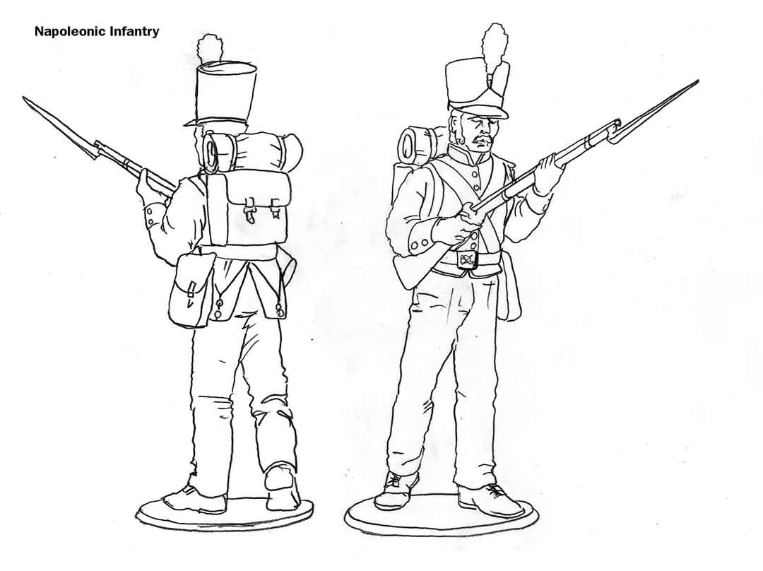
Infantry
1. Legs should be slightly more bent, to convey the impression of activity or movement
2. No mustache
3. Smaller sideburns