July 28, 2005
1. Infantry - new pictures were not included in your email. My last comments were that the infantry needed to be standing upright and if he was going to lean in any direction that he needed to lean forward. Where these changes made?
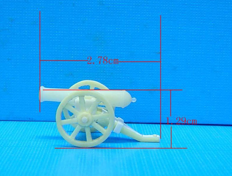
2. Artillery - latest pictures look perfect.
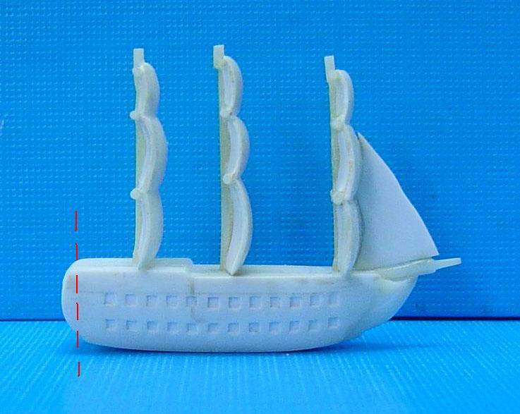
3. Frigate.
I should begin by assessing the positive aspects of the new sculptures:
The sails are less bulgy, the masts appear to continuously connected to the sails (though it's hard to tell from the pictures), the frigate stern has a little detail, the cannon ports are smaller, there are now 12 cannon ports to a row, the base of the frigate has slimmed a little, the bowsprit is shorter, the triangular sail has been added, there are no holes on the deck.
Those are the positive aspects, now for the more critical ones:
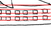 1.
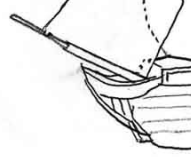
The frigate is still too fat. Notice in the adjacent sketch that you can
divide the height of the frigate into five layers. The top layer is
between the deck and the first cannon port, the second layer contains the top
cannon port, the third layer is between the two cannon ports, the fourth layer
contains the bottom cannon port, and the bottom layer is between the bottom
cannon port and the bottom of the frigate. This sketch was ideal.
What it means is that the height of the frigate should be no more than five
times the height of the cannon port. If you look at the pic of the latest
sculpture, you'll note that the height of the frigate is about eight times the
height of the cannon port. Since the cannon ports are the right size, the
rest of the frigate needs to be reduced in size. The deck can be lowered until
the distance between the cannon ports and the deck is the thickness of a cannon
port, the bottom can be similarly raised, and the distance between the cannon
ports can be reduced to the thickness of a cannon port.
1.
The frigate is still too fat. Notice in the adjacent sketch that you can
divide the height of the frigate into five layers. The top layer is
between the deck and the first cannon port, the second layer contains the top
cannon port, the third layer is between the two cannon ports, the fourth layer
contains the bottom cannon port, and the bottom layer is between the bottom
cannon port and the bottom of the frigate. This sketch was ideal.
What it means is that the height of the frigate should be no more than five
times the height of the cannon port. If you look at the pic of the latest
sculpture, you'll note that the height of the frigate is about eight times the
height of the cannon port. Since the cannon ports are the right size, the
rest of the frigate needs to be reduced in size. The deck can be lowered until
the distance between the cannon ports and the deck is the thickness of a cannon
port, the bottom can be similarly raised, and the distance between the cannon
ports can be reduced to the thickness of a cannon port.
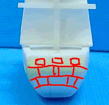
2. The frigate is still too long. Notice the red dashed line that I added in the picture above. The frigate should have this much material removed from its stern and the stern can be more squared off (rather than rounded).
3. The middle mast is too far back (it's too close to the rear mast). The middle mast can be closer to the rear mast than the front mast, but it's too close right now. The simplest solution may be to just make it equidistant between the front and rear masts.
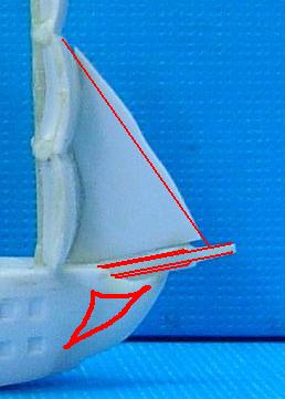
 4.
More detail needs to be added to the bow. Notice the red lines I traced on
the picture above to show how more detail could be added, and notice the extra
detail on the sketch.
4.
More detail needs to be added to the bow. Notice the red lines I traced on
the picture above to show how more detail could be added, and notice the extra
detail on the sketch.
5. The triangular foresail needs to have a straight outside edge. Notice the red straight line I traced on it to indicate where it is wavy and irregular.
6. The bowsprit (the skinny rod) jutting off the bow should have a more subtle transition between the thick section and the narrow section. Also the thick section should not extend as far as it does now. Right now the thick section extends about 70% of the length of the bowsprit, where in the sketch above it is only about 60% the length of the bowsprit or in my red lines about 65% of the length of the bowsprit. The thick part of the bowsprit should only be 60-65% of its overall length and it should be a less defined, more subtle transition between thick and thin sections.
 7. More
detail needs to be added to the stern. Right now there are the three
square holes on the stern, I had hoped to have the added detail of a few lines
etched on it (indicated by the red lines I traced on the above picture).
7. More
detail needs to be added to the stern. Right now there are the three
square holes on the stern, I had hoped to have the added detail of a few lines
etched on it (indicated by the red lines I traced on the above picture).
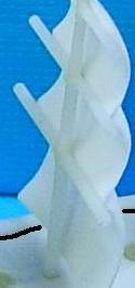 8. The
masts and crossmasts in the first sculpture (indicated by the adjacent picture)
were perfect. In the latest sculpture, they are misshapen (particularly at
the very top) and much thicker than they need to be. Most of the
structural strength in the final pieces should be coming from the sails (which
are connected to the deck), and so the masts don't need to be overly
thick. The thickness of the masts/crossmasts in the initial sculpture is
just right.
8. The
masts and crossmasts in the first sculpture (indicated by the adjacent picture)
were perfect. In the latest sculpture, they are misshapen (particularly at
the very top) and much thicker than they need to be. Most of the
structural strength in the final pieces should be coming from the sails (which
are connected to the deck), and so the masts don't need to be overly
thick. The thickness of the masts/crossmasts in the initial sculpture is
just right.
4. Cavalry
I should begin by assessing the positive aspects of the new scuptures:
The rider is less fat and is better proportioned to the size of the horse, I don't think there are cloven hooves anymore, and the horses' legs are thinner.
Those are the positive aspects, now for the more critical ones:
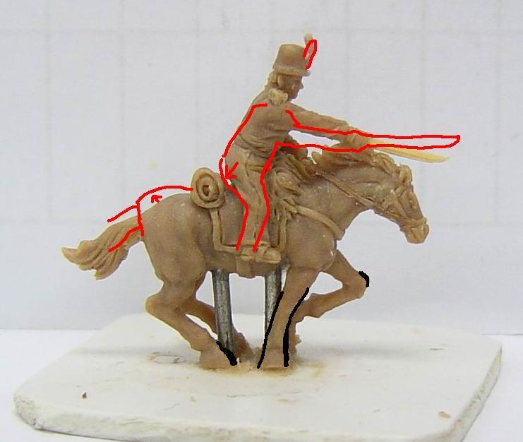
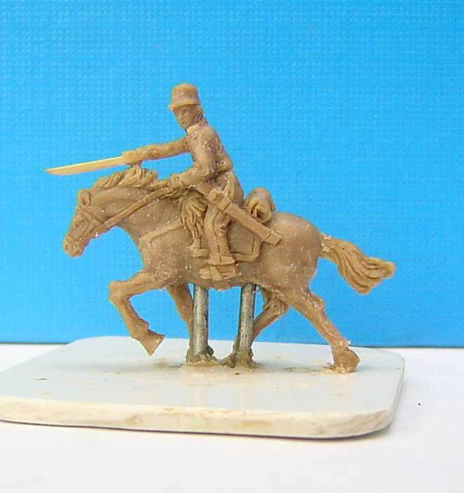
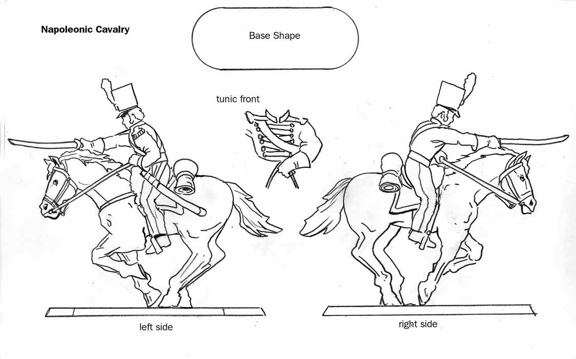
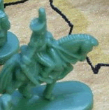 1. Hat - Notice
the hat in the sketch (which is perfect). Now notice the hat on the latest
sculpture. The new hat is missing a plume, and isn't squared off at the
top. I want a rigid plume (one that doesn't get bent by the wind) and a
hat that is more squared off at the top and less rounded on the edges. The
small adjacent picture shows a closeup of the Risk cavalry hat (which I like).
1. Hat - Notice
the hat in the sketch (which is perfect). Now notice the hat on the latest
sculpture. The new hat is missing a plume, and isn't squared off at the
top. I want a rigid plume (one that doesn't get bent by the wind) and a
hat that is more squared off at the top and less rounded on the edges. The
small adjacent picture shows a closeup of the Risk cavalry hat (which I like).
2. Position of sword and arm - Notice the rider's sword and arm in the sketch are horizontal and that the sword barely touches the horses' mane (which is perfect). Now notice the rider's sword and arm in the sculpture are angled downward. I'm not sure what exactly needs to happen to make this horizontal position possible. Some suggestions are: have the horses' head raised up a little more (notice that in the sketch, the top of the horses' mane is even with the rider's armpit); have a smaller torso/waist area (the rider in the sketch seems to have a smaller torso than the sculpted rider, which would lower the position of the rider's shoulder and sword arm); have the rider's arm be at a slight downward angle (not as much angle as is in the sculpture now, but a slight angle - notice that the arm in the sketch is at a slight angle, but then the sword is held perfectly horizontal, whereas the arm and sword in the sculpture are in a straight downward line); put the rider a little lower in the saddle (which would lower the position of the rider's shoulder and sword arm).
3. Rear of horse - The horses' rear end still seems a little low and could be raised a little more. Also, for some unknown reason, the sculptor changed the location of the horses' rear legs. In the sketch and in the initial sculpture, the rear legs were both underneath the horses' body, in the latest sculpture, the horses' back left leg is jutting out from the back. I would prefer it to look just like it does in the sketch, where all the legs are underneath the horses' body.
4. Rider's face - In both the sketch and the initial sculpture, the rider's
face was facing forward (which is perfect). On the latest sculpture, his
face is facing to the left side. I would prefer the rider facing forward.