Sculptures #1
July 11, 2005
Critiques - the sketches are so perfect, I'm essentially pointing out differences between sketches and sculpts.
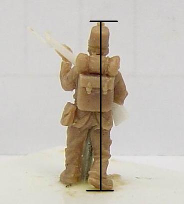
Infantry
1. needs to stand upright from all viewing angles, if it leans at all, he should
be leaning slightly forward, not backward.
2. detail on the gun can't be seen because it's white on white in the picture
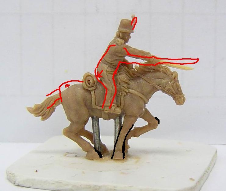
Cavalry
1. plume on hat shouldn't be bent by the wind as much
2. rider should sit a little lower in the saddle
3. rider is too fat
4. backend of the horse is a little low - the front end of the horse looks good and is charging ahead, the back end looks as though the horse might
be about to sit down
5. sword and arm should be more horizontal - putting the rider lower in the saddle would allow this to happen and still allow the sword arm to
connect to the horse's mane
6. no cloven hooves on horse (a couple of pics seem to indicate that they are
cloven in the sculpture)
7. the cavalry rider should be just a little smaller or the horse larger
8. horses' legs should be a little thinner - the thick legs make the horse
appear slightly gnomish
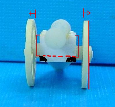

Artillery
1. distance between the wheels needs to be a little wider (the barrel should not be changed - just the width of its support)
2. the solid squarish block under the barrel needs to be chamfered back and rounded in underneath
(you can see this in the closeup of the sketch I've shown above)
3. wheels need to be vertical, it looks as though they have a slight outwards tilt to them.
4. the support piece coming back needs to be symmetrical - it looks like the last little segment (the part that touches the ground) is angled off to
the right and not centered
5. add a band/block to the support coming back to give it a little more detail
(I've traced this out on the pic above)
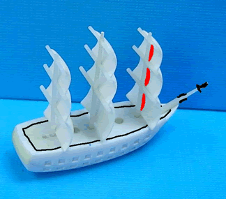
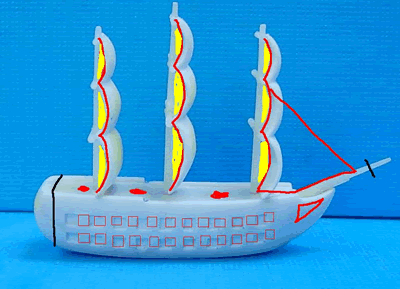
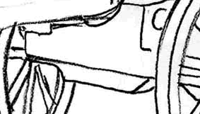
Frigate
1. sails could be a little less full, still should have a curved bulge, but doesn't need to be quite as much
curve
2. the masts should continuously connect to the sail, even where the sail bulges
out - this should eliminate undercutting I think
3. stern of the frigate has no detail and is rounded. It should be more squared off and have the little bit of detail from the sketch
(see last frigate pic above)
4. cannon ports are too big. The sketch shows 22 square cannon ports along the side - 2 rows of 11 each. The sculpting only has 18 square cannon
ports - 2 rows of 9 each. In the middle pic above, I've drawn 12.
I'd like between 11-14, the more the better, the main thing is to have more of
them than the current sculpture has and make sure they stay square.
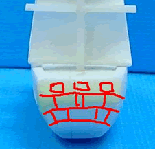
5. base of the ship appears fat (not the mast & sails, the base) - it is a little too tall, a little too wide, and even a little too long (In fact -
if you look at DSC00277.jpg, and you notice the ridged rim around the top edge of the base - if the ridged rim and its accompanying thickness were
removed from the entire ship on all sides and the bottom, then it would be just right)(in
the pic above where I've traced the outline of the ridged rim, you could cut
along the black line I traced to remove material and make the ship more
streamlined)
6. the bowsprit jutting off the bow could be just a little shorter
7. bowsprit needs the triangular sail added (see artist sketch or see the middle
pic above where I drew it out)
8. detail needs to be shown on the curved bow (see artist sketch or see the
middle pic above where I drew it out)
9. no holes on the deck - I'm guessing those were from trying to position the
sails properly and weren't intended - but I do want to clarify that the deck
shouldn't have holes.